Model Explainability
A key feature of our product is that it can justify its classifications. This is something we find essential, as explainability is crucial for building trust with the healthcare professionals who will be using our product.
Shapley values
To achieve this, we used Shapley values. Derived from game theory, Shapley values help us understand how each time step or feature contributes to the model’s predictions. Shapley values work by evaluating the contribution of each feature, at each time step, in all possible combinations. The result is an estimation of how much each value contributes to the model’s output. Using the SHAP package, we can easily estimate the Shapley values of new data we feed into the model, and show healthcare professionals exactly which intervals and heartbeats informed the classification.
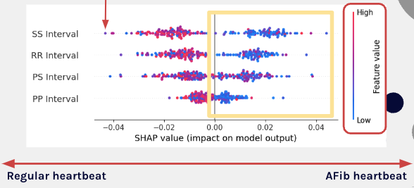
Here’s a visual of what the SHAP values for 200 classifications look like. This plot is a little intimidating, but just keep three things in mind. One, each point represents one timestep for a given feature. So for example, a dot in the top row is one SS interval for one heartbeat. Second, keep in mind that the color of each point corresponds to how large the interval was. Longer intervals are red, and smaller intervals are blue. The last thing to remember is that if a dot is to the right, it’s telling the model that AFib is more likely. If the dot is to the left, the data point is indicating a regular heartbeat.
We can pretty clearly see that the smaller intervals in blue are telling the model to classify the heartbeat as AFib, as the blue dots tend to be closer to the right side of the plot.
Interpreting model outcomes
Let’s go through an example to show how SHAP values can explain the model’s outcome. Remember that the output is the probability of AFib.
Here we see an explanation for the classification of one heartbeat. We see that the expected value for our model is 0.461, which is the baseline probability for AFib for our model in general. This is a reflection of the background data we fed to the SHAP function, where 46% of the heartbeats were AFib. The average interval length for all four features in the input sequence is on the y-axis.
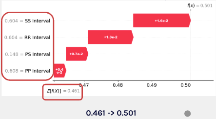
This graph shows how each feature moves the prediction from the baseline to the final prediction. In this case, all features move the prediction closer toward AFib, with the SS Interval contributing the most, and the PP interval contributing the least.
Overall, Shapley values allow us to explain our prediction, down to the feature and timestep level. This explainability allows healthcare providers to understand the reasoning behind the model’s decisions, enabling them to confidently validate that the model is identifying patterns grounded in real-world data.